Create Your First Project
Start adding your projects to your portfolio. Click on "Manage Projects" to get started


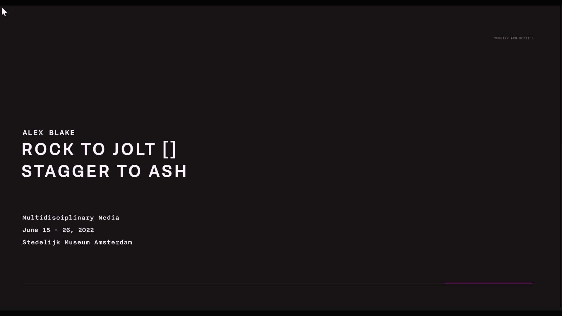
Holland Festival
Project Type
Duration
Team
Art Direction, Microsite
5 Weeks (Nov - Dec 2022)
Stephanie Ma (myself), Eunice, Yuki, Emma
This project explores the various design qualities and principles from Ellen Lupton and Wim Crowel where students got to explore expressive and functional web designs during the final weeks. Throughout the project I took part in image grouping, designing posters, making wireframes and designs for the web. The main tools used for this project was Figma.
Design Qualities and Principles
We began this project by conducting research on our precedent designer Wim Crouwel. Wim Crouwel is a modernist graphic designer and typographer from the Netherlands, who was inspired by Swiss and Bauhaus design. His work was seen to be poetic yet structured, conveying the content efficiently without sacrificing the visual interest. The design qualities were extracted from his designs while principles were derived from Ellen Lupton. I did research on the designer and image groupings of his various works to pinpoint design qualities we can use in our design.
Design Qualities

Usage of Lines and Shapes to Organize Content
Information is surrounded with shapes and rulers to separate ideas and content, creating digestible pieces.

Spatial tension to invite a closer look at content
Tension in spacing between type, images, and shapes challenges legibility, causing viewers to stop and take a closer look at the work.
Design Principles

Transparency to Create Hierarchy and Depth
Transparency is used to emphasize areas and draw attention.

Grouping Shape and Type to Create Larger Entities
Clustering of type creates new visual shapes when in proximity of each other.

Contrasting Textures in Images to Create Dimension
Using textures to separate and bring attention to specific content.
Lines of Investigation
As a group, we examined the different design qualities and principles. Which we further made into lines of investigation by using more than one quality or principle in our poster designs. I took part in designing the posters.
Three Lines of Investigation and Posters
Tension + Transparency

Limitation + Transparency

Dimension + Transparency + Proximity

Art Direction Approaches
Our client for the project was Holland Festival, it is the oldest and largest performing arts festival in the Netherlands. It consists of different types of visual and performing arts such as theatre, music, opera, dance, visual arts, film and architecture. We conducted three final designs, where the black design was my original idea and and the other two I contributed to the layout and refinement of.
Three Final Design Approaches
Final Poster

Iterations
visual distractions are reduced by using color blocks and glitch effect
shapes and transparency of colours are explored
blocks of colour and type create balance between the elements and white space
saturated colors overlay well on black backgrounds, retaining some vibrance while creating dimension with transparency

Final Poster

Iterations
type are grouped to create clusters and serif font exploration
the created grid separates content to bring attention to each piece of information indivually
high contrast in thick and thin lines in type creates tension, drawing attention
A simple high contrast colour pallete enhances the already existing contrast of type weight

Final Poster

Iterations
Content is isolated using heavy white space and creates asymmetry
close proximity of type, image, and shapes work together to create an overall image
shapes section off areas for different information to be placed
spacing of type creates tension and attracts interest when viewed from afar

Print to Web
The art direction I created was pursued and developed into a microsite. Various website layouts and interactions were explored, ranging from functional to expressive, where I took part in the ideation and design process. The microsite converged towards the most expressive line. The pages were designed to incorporate our qualities and principles in a cohesive and functional manner.
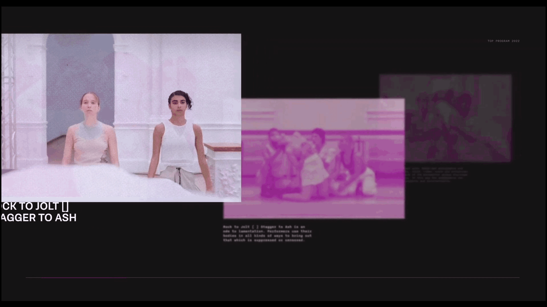
The microsite aims to showcase the collection of the top most recent programs of the 2022 retrospective. Using expressive colours to introduce the excitement of the festival and uniquely treated images helps to encourage a closer look at content. Using the four colours from the original poster, content is organized in colour sections.
Final Poster

Home Page Iterations

Precedents

Exhibition Identity
Saturated colours retain vibrancy when overlaid on
the black background while creating dimension when overlapping with lower transparencies.
To differentiate the exhibitions, colors from the precedent poster were assigned to each one. The colour was then used throughout the whole exhibition page to create unity.


Type Choice
Dutch type is used to reflect the cultural origins of
Holland Festival. Brenner Sans is a neo-grotesque typeface with low contrast and horizontal terminals that allows tight tracking to create a compact appearance.
It is paired with a Grotesque typeface, Nitti, with similar but more irregular forms to contrast the rigid Brenner sans.
Headers and Large Text
Body Copy and Captions


Final Microsite
First Impressions
When users first enter the site, an animation will be present. Transitioning from "Holland Festival" to the exhibition exploration page.
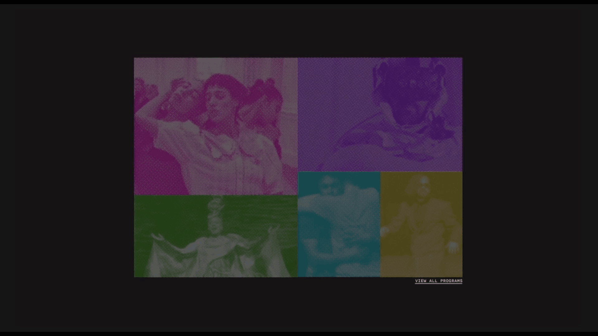
Home Page Introduction
Different exhibitions are organized using shapes and colour, the rectangles create tension. The images start at a low opacity and periodically blink by adjusting transparency to indicate to the user these elements are interactable.
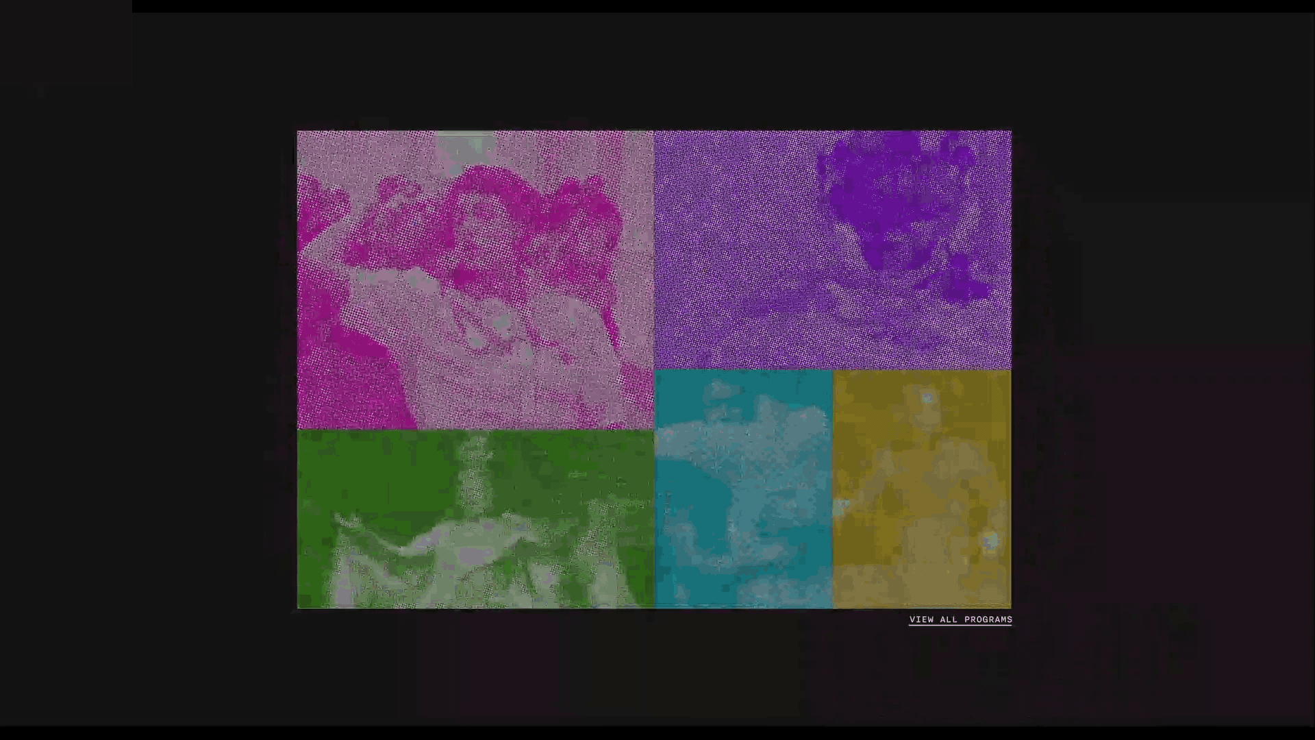
INTERACTION
Periodic blinking animation of exhibitions
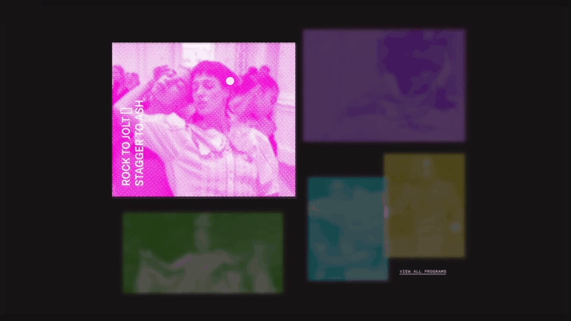
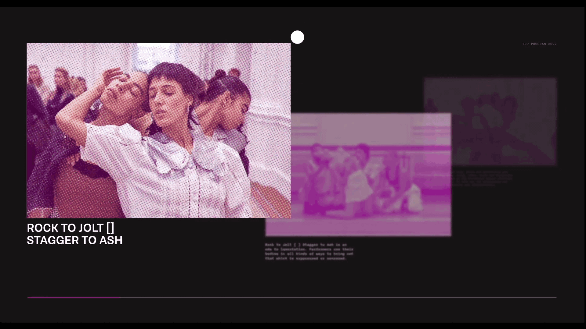
Selecting an Exhibition
Hovering over an image causes it to enlarge, increase in opacity, and the appearance of exhibition title while pushing other elements on the page away. This separates the important information, emphasizing the exhibition the user is interested in.
INTERACTION
Hover over an exhibition to enlarge it
Unimportant information casted back in the depth of field
Images animate to mimic floating
Transitioning from Home to Exhibition Page
After clicking on the image, it repositions itself to where it lies on the exhibition page. This leads the animation as the other exhibitions are pushed away and reveals the rest of the selected exhibition page.
Rectangles are used repeatedly throughout the site as a cohesive element.
INTERACTION
Click on exhibition to prompt animation
Introducing the Exhibition
Being introduced with a blinking image to indicate intractability, the user can hover over the image to play a video showcasing the overall exhibition. To maintain coherence, the halftone is carried over from the image to the video.
INTERACTION
Hover over the image to prompt video to play
Explore and Discover
The information is displayed using depth of field. By scrolling the mouse, the exhibitions cycle through, emphasizing the important information by lowering the intensity of the monochromatic halftone filter to increase visibility and understanding of content. The other information is lower in transparency, creating depth and hierarchy.
INTERACTION
Mouse scroll to uncover new information
Timeline at bottom to show how far into exhibition user is
Continued Exploration
When the cursor hovers on the far right corner at the end of the current exhibition, it will become an arrow to indicate further exploration. Replacing a stationary arrow element, the cursor arrow limits the amount of space used in the composition to elevate the displayed information with white space.
INTERACTION
Curser hover to prompt next exhibition
Mouse click to begin animation to the next page
Curser changes shape to indicate intractability
Returning to Home
When the cursor hovers on the top left corner at the end , it will become an arrow to navigates back to the home page.
INTERACTION
Curser hover to prompt going back to home page
Mouse click to begin animation to the home page
Curser changes shape to indicate intractability
Final Assets

Learning Outcomes
Through this project I was given the opportunity to be experimental and test various design compositions and styles I would not have had in the past. I learnt to examine different precedents and aspects of the client to apply new techniques to my own designs. As well as, creating a uniform art direction for the various art exhibitions of the client. Above all I learnt the importance of receiving critiques and iterating my work weekly to create the best possible work in the tight time frame.